

Key Takeaways
Why Color Feels Complicated (But Doesn't Have to Be)
Most people don't struggle with individual colors — they struggle with combinations. A shirt looks great on its own, pants look fine in the closet, but together the outfit feels off. That disconnect usually comes down to color relationships, not color quality.
Color theory, the study of how colors interact visually, gives us a practical framework for understanding why some combinations feel harmonious and others don't. You don't need to memorize a color wheel to apply these ideas. But knowing a few core principles can make getting dressed significantly less stressful. If your outfits frequently feel disjointed, it's worth checking out what's usually going wrong with everyday outfits — color is often just one piece of the puzzle.
The Foundational Frameworks for Pairing Colors
Two color relationships do most of the heavy lifting in everyday dressing:
- Analogous colors sit next to each other on the color wheel — think blue, blue-green, and teal, or rust, orange, and gold. Because they share undertones, they naturally feel cohesive and easy to wear together.
- Complementary colors sit opposite each other on the color wheel — blue and orange, purple and yellow, red and green. They create contrast and energy, but need to be balanced in proportion to avoid looking chaotic.
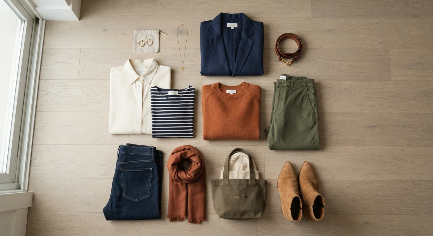
For most everyday outfits, analogous combinations are the lower-risk choice. Complementary pairings work well when one color dominates and the other appears as an accent — say, a navy outfit with a burnt-orange scarf or bag.
The Role of Neutrals and Undertones
Neutrals — black, white, navy, grey, camel, cream, and olive — are the connective tissue of a working wardrobe. They don't compete with other colors; they frame them. Building outfits around a neutral base and adding one or two colors keeps things readable without looking flat.
Undertone is where many people unknowingly create clashes. Colors have warm undertones (yellow, red, or orange base) or cool undertones (blue, green, or purple base). Mixing a warm-toned khaki with a cool-toned grey can look muddy, while pairing a warm camel with a warm rust looks intentional. This is also why some neutrals don't work together — a cool-white shirt and a warm-ivory trousers, for example, can look mismatched even though both are technically neutral.
When shopping or assembling outfits, try to match undertone families rather than just hue families. This applies to seasonal wardrobe transitions too — warm autumnal tones and cool spring pastels rarely play well together across seasons.
Common Color Clashes and How to Fix Them
Several color combinations reliably trip people up. Understanding what causes the clash is more useful than memorizing a list of forbidden pairings.
- Competing saturations: When two highly saturated colors share equal visual weight, neither reads as an accent. Solve this by making one piece more muted or neutral.
- Mixed undertone neutrals: As noted above, warm and cool neutrals often don't mix well unless there's a clear bridge — like a patterned item that contains both undertones.
- Tone-on-tone without enough contrast: Wearing the same hue head-to-toe can look intentional or shapeless depending on fit and finish. If you're going monochromatic, vary the texture or fabric weight to create visual interest.
- Pattern-on-pattern without a shared color: Two patterns can coexist if they share at least one color and differ significantly in scale — a large plaid with a small stripe, for instance.
Color decisions also intersect with dress code expectations. A bold complementary combination that reads as creative in a casual setting might feel out of place in a more formal context. For more on that, see our guide to dress codes.